In total, I managed about 20 designers in several product portfolios. In addition to Product and Communication Designers, I selected and worked with more specialized specialists: UX editors, UX researchers, CX designers, Design System Designers, AI Designers, Design managers, Design producers, Design leads, Art Directors.
Below is a case study of effective work with UX researchers and CX designers.
In it, I taught the company to conduct research and influence metrics.
In it, I taught the company to conduct research and influence metrics.
The information presented below may not be stored, distributed or used for commercial or personal purposes without obtaining the written consent of the owner.
Largely due to the impact on SUM metrics, we reduced Time to Market by 32%, Product Discovery by 48%, Product Delivery by 63%. Thanks to a new principle of resource organization, architecture, processes.
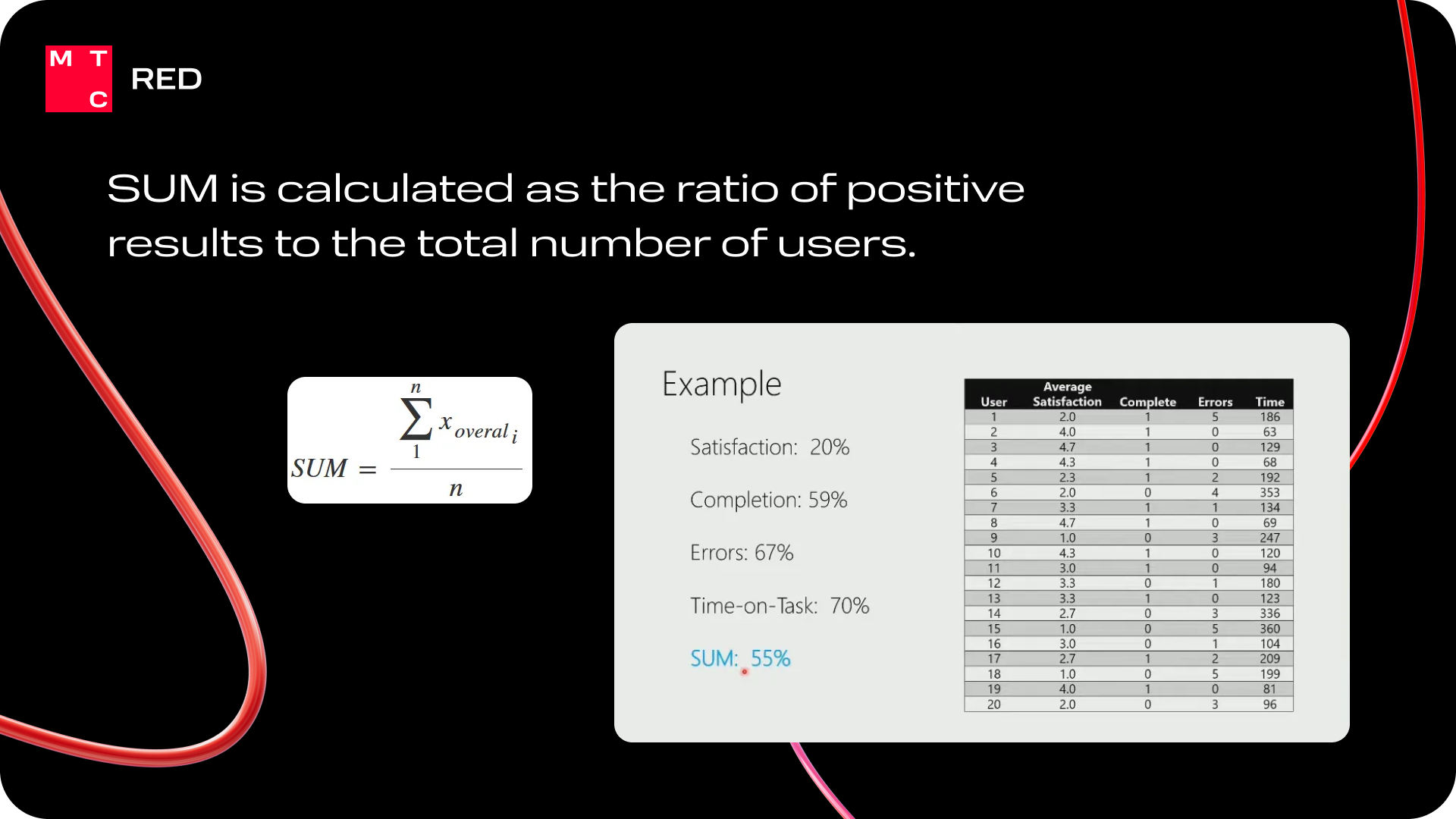
Case of implementation of SUM metrics.
Problem: In cybersecurity, you cannot measure quantitative metrics from products.
Limitation: Cybersecurity products are kept in a closed customer environment to keep them secure, and no data is allowed to be collected from them.
Solution: Implement tracking of metrics that improve products, which will be possible to collect in a closed environment.
Due to old habits, the business was not ready for customer research, but I proved the effectiveness of this approach. At first, I myself came to closed circuits of clients and conducted research on prototypes.

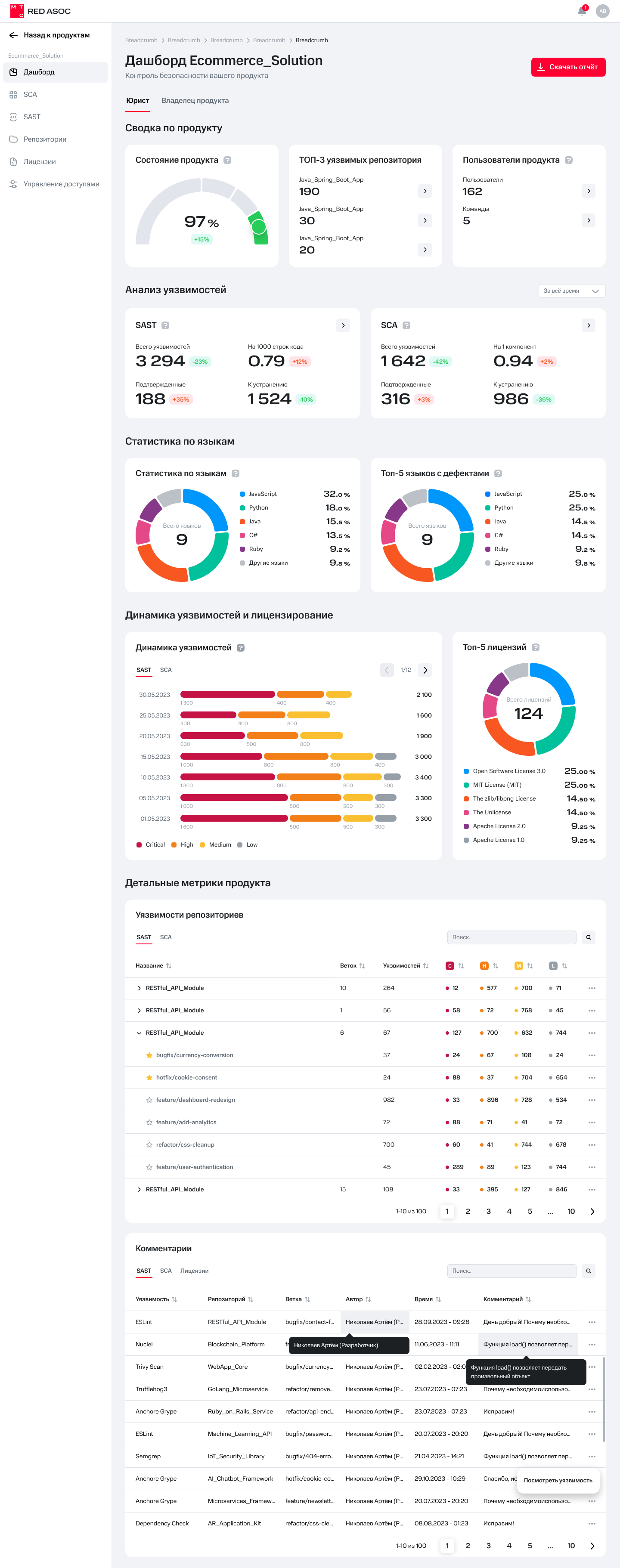
Below is the first version of the tested interface for monitoring load and incidents.
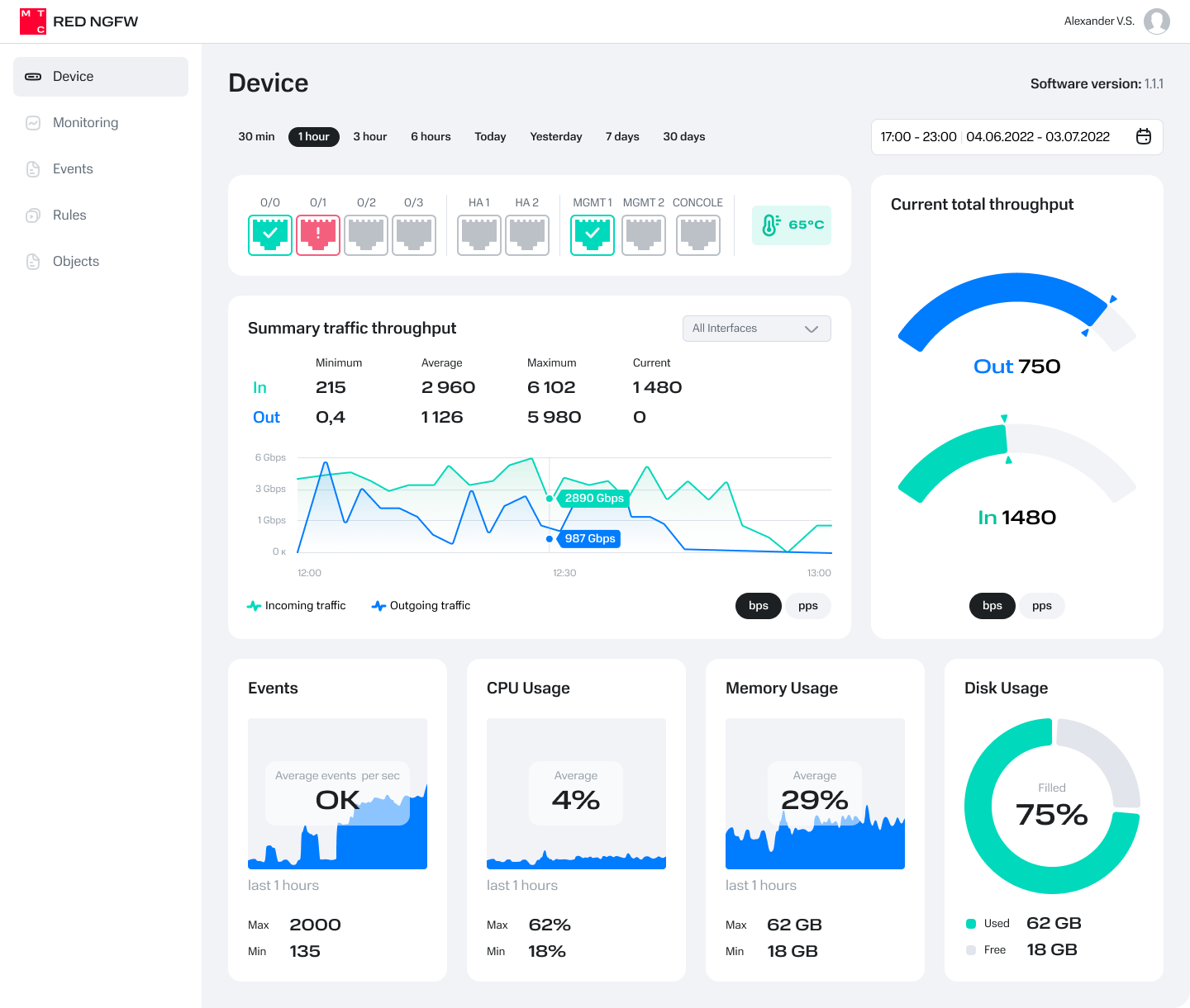
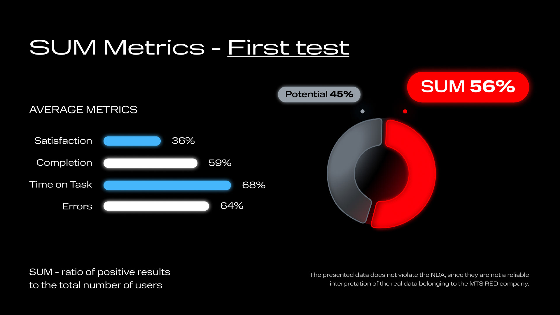
We measured: 1) Completion 2) Time on Task 3) Errors 4) Satisfaction
The following picture does not show real data, it is just a calculation example.
The very first series of studies clearly showed the business that the current product had too low an indicator of task completion and satisfaction from use. This means that a significant part of users could not process incidents at all without additional help, which takes additional time. And processing delays can cost companies millions.

Problem: Some users were unable to process the incident because they could not compare graph data from different pages because it was not presented clearly.
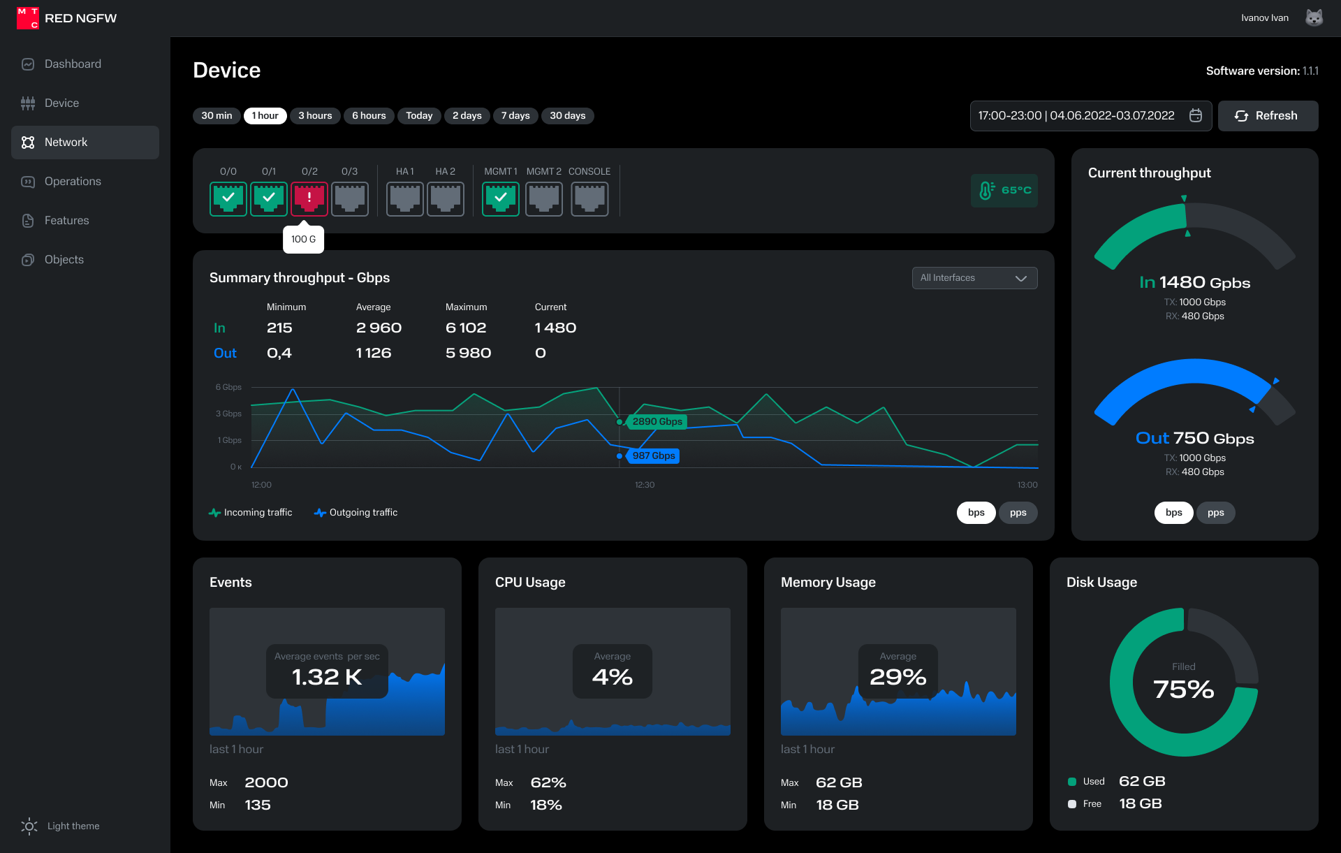
Solution: Depending on the user’s Role in the system, we have highlighted in color the peak values on the graphs that need to be compared.
We created an easily perceived color scheme.
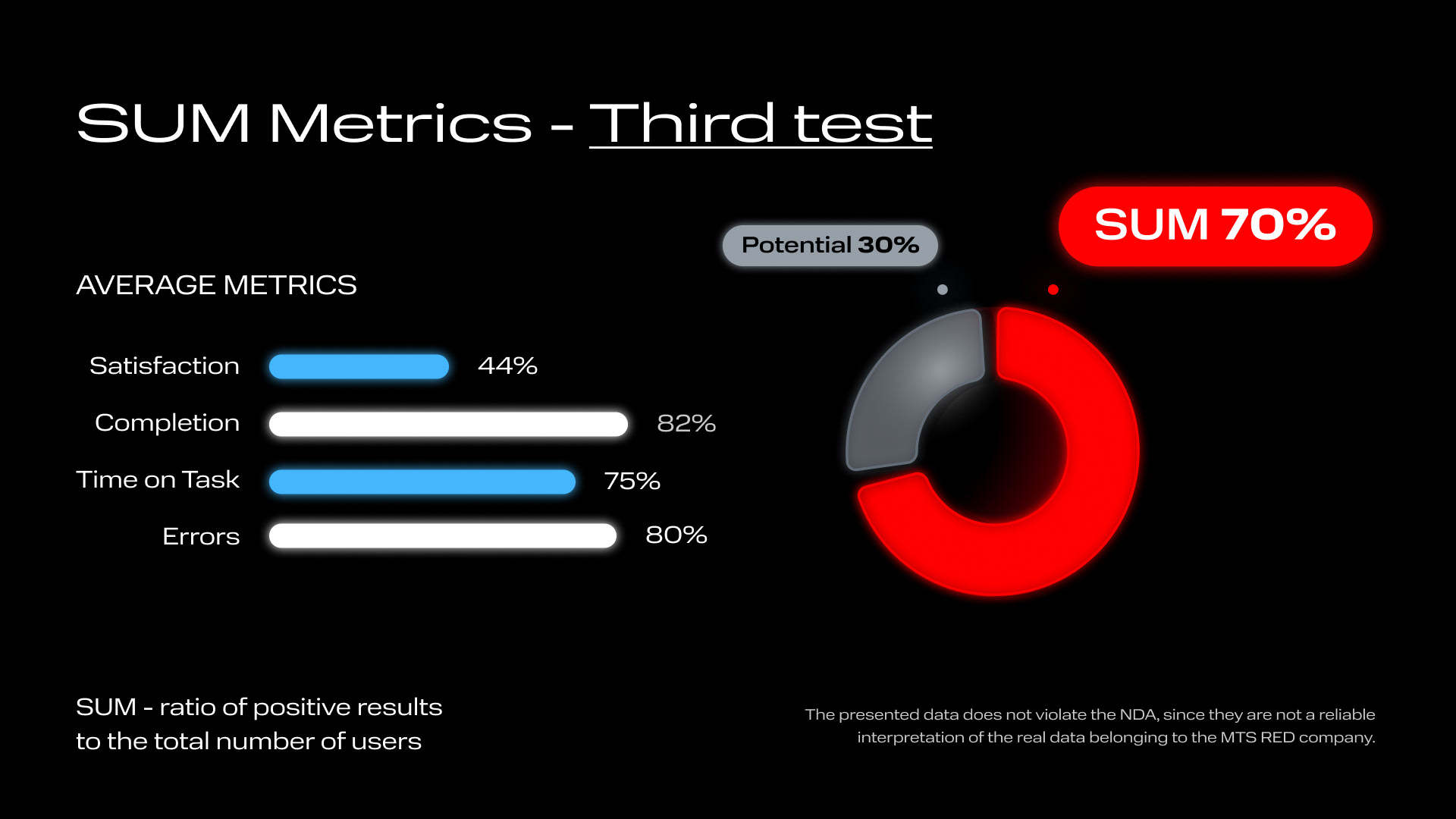
First of all, our changes had the effect that many more users were able to complete their tasks without resorting to additional materials, and they made significantly fewer mistakes. But overall satisfaction and time scores remained weak points.
Thanks to the fact that I showed the Business the evolution of products using the Data Driven approach, I was allocated resources to regularly conduct research, which I built into the piloting stages of our products.
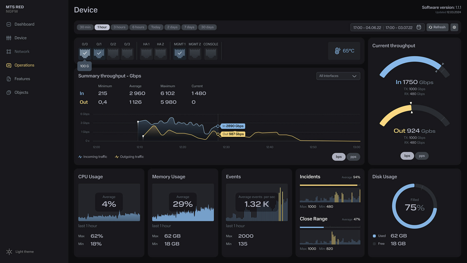
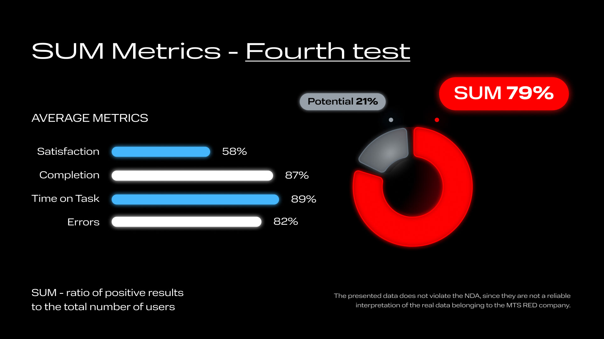
The final version of the interface (below) is significantly different from the previous ones, because we have radically revised the approach to solving problems for users.
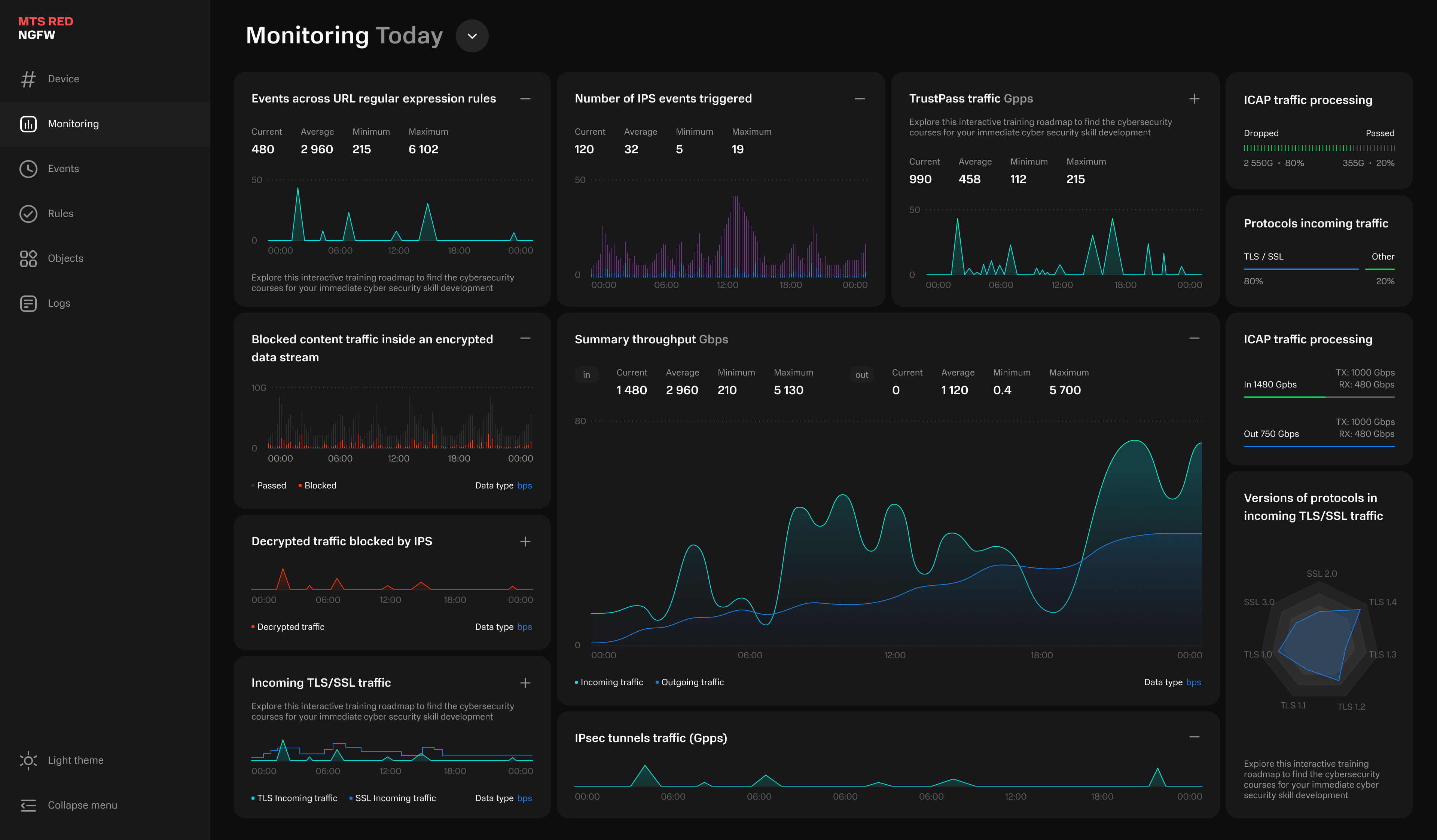
The fact is that in reality these interfaces are displayed simultaneously with the interfaces of other products on closely adjacent monitors.
For each role, we chose certain interface colors that were easy for them to read. They ignored other blocks and colors. For example:
- An incident response engineer needs to analyze only blocks with red color; they can be easily found on adjacent screens where dashboards of different products are displayed.
- The remaining roles only needed to analyze blocks with green or purple color.
- An incident response engineer needs to analyze only blocks with red color; they can be easily found on adjacent screens where dashboards of different products are displayed.
- The remaining roles only needed to analyze blocks with green or purple color.

Result:
- Thanks to the updated design solution, we have improved subjective satisfaction and reduced the number of errors in the process without compromising other criteria.
- I taught the company to influence metrics and improve its weak points.
- Thanks to the updated design solution, we have improved subjective satisfaction and reduced the number of errors in the process without compromising other criteria.
- I taught the company to influence metrics and improve its weak points.
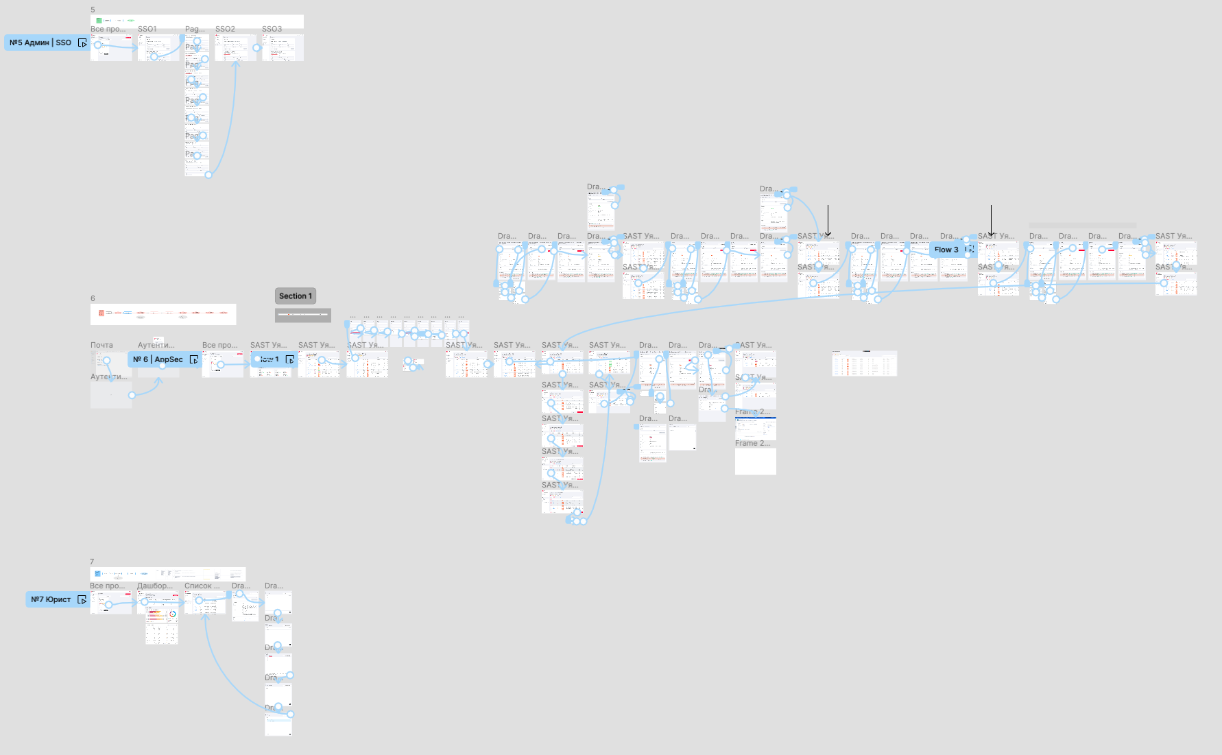
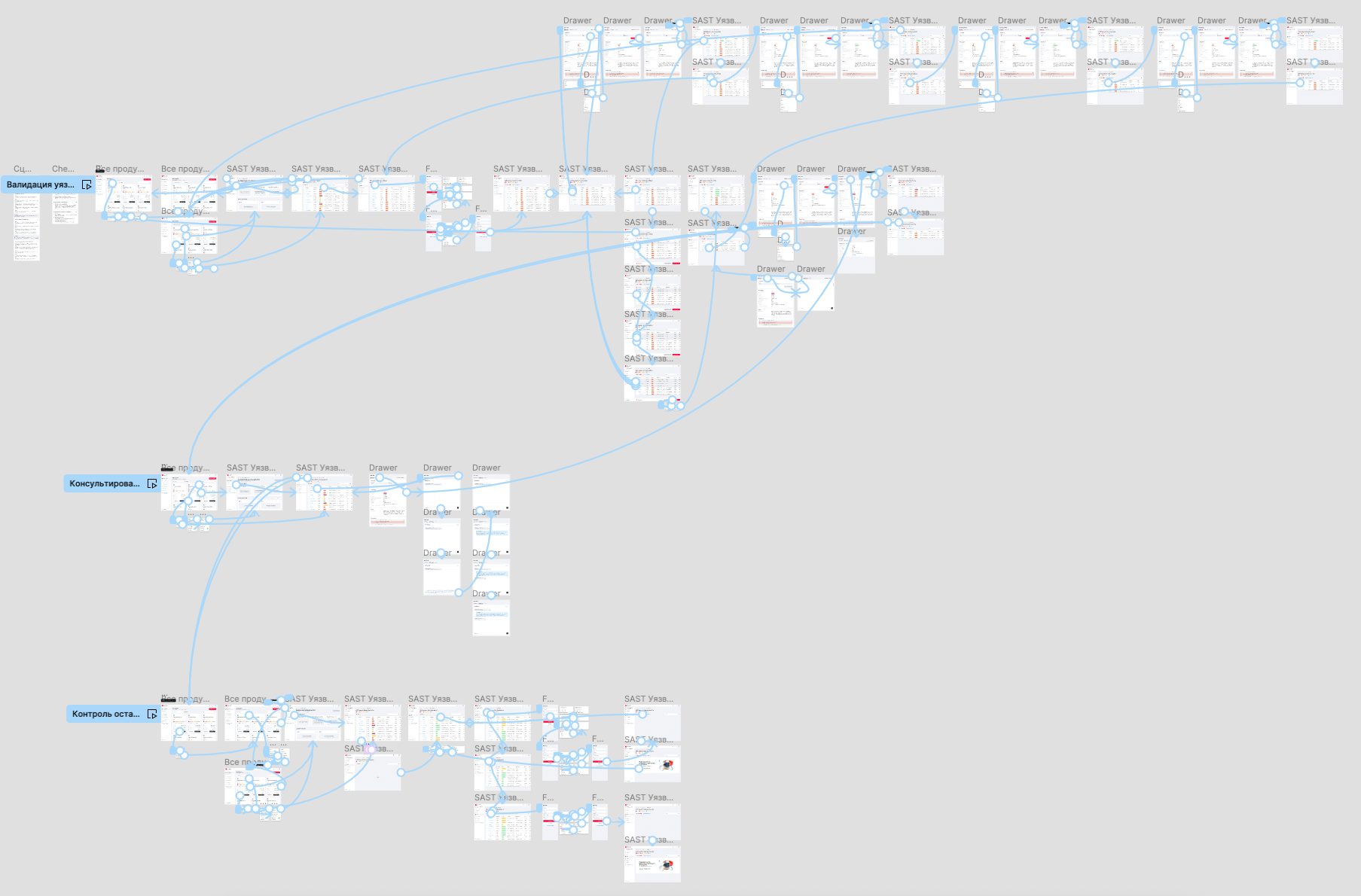
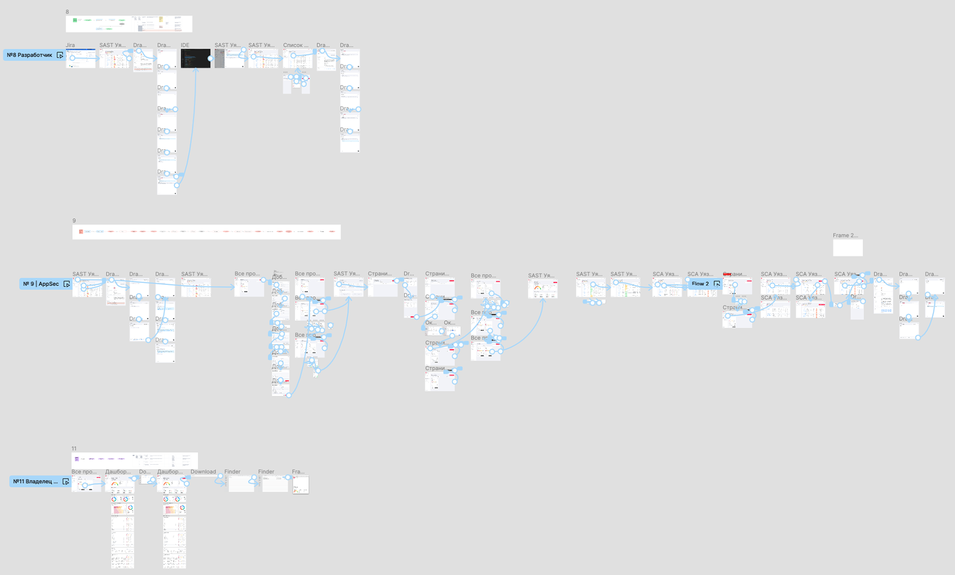
Other interfaces.
Demonstration of one component from the Design System with application templates.
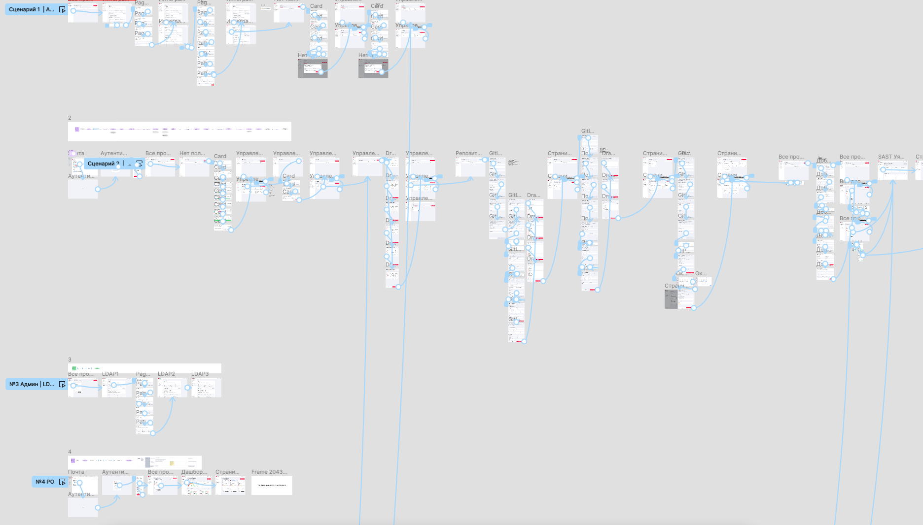
4 main scenarios for one of the products.
In the video the scale is increased for the Demo - in reality on the monitor the scale is smaller.